User Experience (UX) and User Interface (UI) Design and Definition
An innovative digital platform for purchasing high-quality baby products, emphasizing personalization and a seamless shopping experience.
Overview
User Experience (UX) and User Interface (UI) design and specification.
A unique digital platform for purchasing high-quality baby products, with a focus on personalization and a seamless shopping experience.
Research
Market analysis
Leading up to the website’s specification phase, I conducted a market analysis where I analyzed existing digital platforms, particularly those selling baby products, focusing on their User Experience (UX) and User Interface (UI).
Competing businesses
Online product purchasing platforms
Marketplace and digital content repositories
Take aways
Homepage
1
The pain points were identified and categorized into five categories
Call to purchase
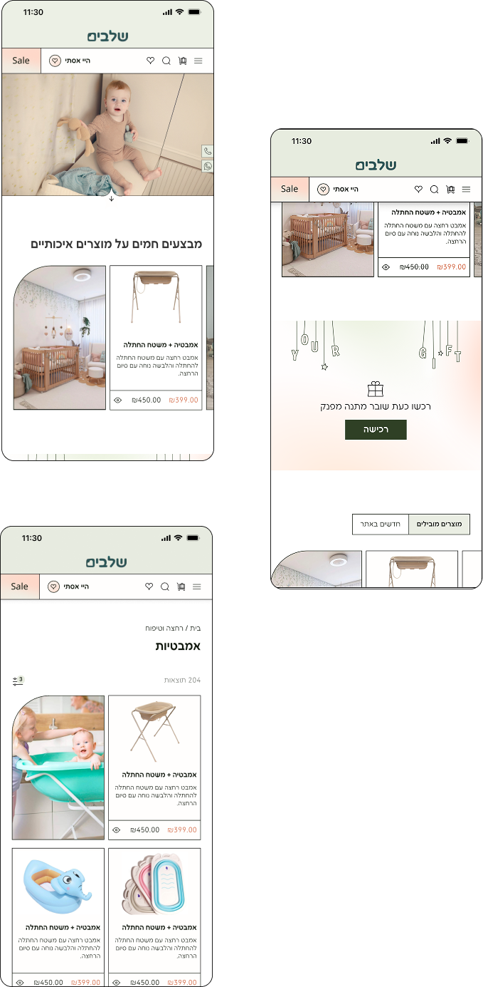
A prominent section with an offer to purchase a gift voucher, including a call to immediate action.
Prominent chat button
A prominent chat button that enables discreet and secure communication with the advertiser.
Customer Reviews: Trust and Smart Decisions
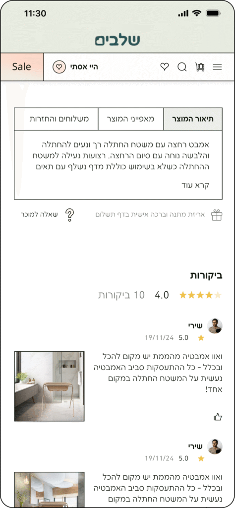
Clearly displaying customer reviews, especially with photos, enhances trust, showcases the product in reality, and helps users make informed purchase decisions.
Valuable Reviews
We incentivized users to submit reviews by providing discount coins for future purchases, which also boosted their loyalty for subsequent orders.
Quickly Contact the Seller
On the product page, we added a quick option to contact the seller, allowing users to easily and rapidly clarify questions or concerns.
Product page
2
"Quick View" Pop-up
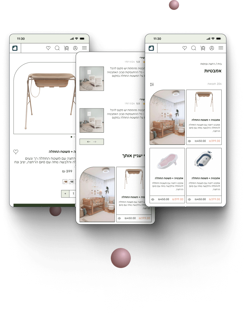
The "Quick View" pop-up provides convenient and fast access to product information without interrupting the browsing flow on the shop page.
Atmospheric images alongside products
create ambiance and illustrate the product's use and context.
Shop page
3
Upgraded Checkout Process
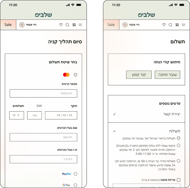
We've broken down the checkout process into 3 steps:
Shopping Cart - Summary of Amount
Technical Details such as Adding a Coupon, Shipping, etc.
Entering Credit Card Details.
Reducing Unnecessary Information on the Checkout Page
Saves the user from irrelevant information and simplifies the payment process.
Shopping Cart and Checkout Page
4
Large and realistic product images
provide a wealth of information about the product, increase trust, and enable users to make more informed purchasing decisions.
Pop-ups in the same format and location
create consistency and prevent confusion, thereby contributing to a better user experience.
Filling in Relevant Information Fields
Conserves user time and effort, facilitating rapid and efficient process completion.
Highlighted Price
Draws the customer's attention and makes it easier for them to quickly identify the price.
In general
5
Survey
Distribution of a dedicated survey for parents interested in purchasing baby products online
We distributed a dedicated survey to parents interested in purchasing baby products online. The survey included questions designed to understand their key needs, concerns, and preferences while examining the influencing factors.
The main question: Do you also have disappointments and concerns about purchasing through a website? If so, what are they?
(109 respondents)
Noa, 26 years old, a young mother working as an insurance employee. She is practical, caring, and social, with quick learning skills, multitasking abilities, and strong relationship-building skills.
biography
To provide the best for her baby- To save time and effort in managing daily life- To build a community with other mothers – To receive reliable and easy-
to understand information about parenting and baby products- To use high-quality, safe, and convenient products- To try innovations and technology to make life easier-
Needs
Fear of choosin unsuitable or unsafe products –
verwhelmed by excessive information making decision-making difficult –
– Feeling lonely in motherhood
– Lack of sleep and social pressure to be the “perfect mom”
– Uncertainty in making decisions for her baby
– Fatigue and lack of time for daily tasks
Pains
Naama Levy
Age: 28
Jerusalem
Married +4
payroll accountant
“I just want to buy what I need easily without getting tangled up in all these details.”
challenge
1
Security & Responsibility
How might we instill confidence in users regarding products, even when they are expensive?
How might we communicate with users about shipping to prevent frustration?
How might we ensure user satisfaction even after the purchase is completed?
How might we accurately describe the product the user is about to receive?
How might we make returns and exchanges easy and user-friendly?
2
Personalization
How might we provide personalized service tailored to customer needs?
How might we accurately describe the product the user is about to receive?
3
Delivering the Right Message
How might we ensure the website remains fun and easy to use while maintaining a high-end, boutique feel?
How might we attract both luxury-seeking users and those who prioritize affordability?
Brand Values
Form
We used rounded rectangles on one side alongside rectangular strokes with sharp edges to convey innovation and cleanliness. Additionally, we added ambient images to create a relaxed and comfortable atmosphere, influencing the shopping experience.
Color Scheme
The use of pastel colors, vibrant green, and soft orange evokes warmth and humanity, connecting a soft aesthetic.
Lighting
We used transitional lighting in peach and greenish tones to create a soft and calming atmosphere. The combination of warm and fresh colors creates a sense of harmony and flow between the elements, offering a pleasant user experience that connects the website to the world of babies and parents.
Developing a language
To create a calm and pleasant user experience, especially for users in stressful situations, I chose the color turquoise (#5ED2C8), a light background (#F4F6F7), and blue-gray (#4D5E6D). This combination creates a pleasant harmony and a relaxed atmosphere to reduce stress and anxiety.
Font
Fb Coherenti Sans
Light
Medium
Body- 14px
H2- 18px
H1- 24px
Icons
FCD8CC#
#E7ECDF
#2f4025
Screens
A clear stepper showing the posting steps, helps users in moments of stress.
A prominent section with an offer to purchase a gift voucher, including a call to immediate action.
Adding a search button for item type selection.
The “Quick View” pop-up provides convenient and fast access to product information without interrupting the browsing flow on the shop page.
A prominent chat button that enables discreet and secure communication with the advertiser.
Direct advertisements on the homepage with filtering for personalized results.
Use the notification option to save yourself from laborious ad tracking.
We’ve broken down the checkout process into 3 steps:
– Shopping Cart – Summary of Amount
– Technical Details such as Adding a Coupon, Shipping, etc.